
During October and November, British Fencing worked on a project with UX Design students from General Assembly on a project to update the user experience of the main BF website. This was completed with a final presentation on the 2nd November.

A group of four students – none of them fencers – worked along with a selection of athletes, coaches and parents on changes they would like to see to our digital offering, particularly in the navigation of the website and what we can offer people completely new to the sport. (We’d like to thank everyone from the fencing community who participated in the project).


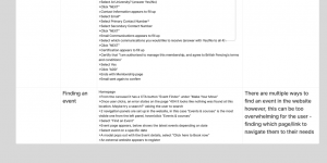
The students produced a huge range of material looking at how people approached the website and what could be improved, backed up with user testing data. They also produced a hi-fidelity clickable prototype showing their vision of what the BF website could look like.
BF are currently working through the material and building a plan to bring updates and improvements. This will not be implemented overnight, but this project was an important milestone in achieving the goal of a best-in-class website to bring people to and keep them in the sport. (It appears that one of the students was inspired to start fencing, too!)
BF would like to thank Salony, Sam, Stefanija and Nicole for their work, along with all at General Assembly.
Don’t miss the latest news. Subscribe to our weekly summary email, The Fencing Digest, featuring the previous week’s latest news and announcements. Sign up here.
