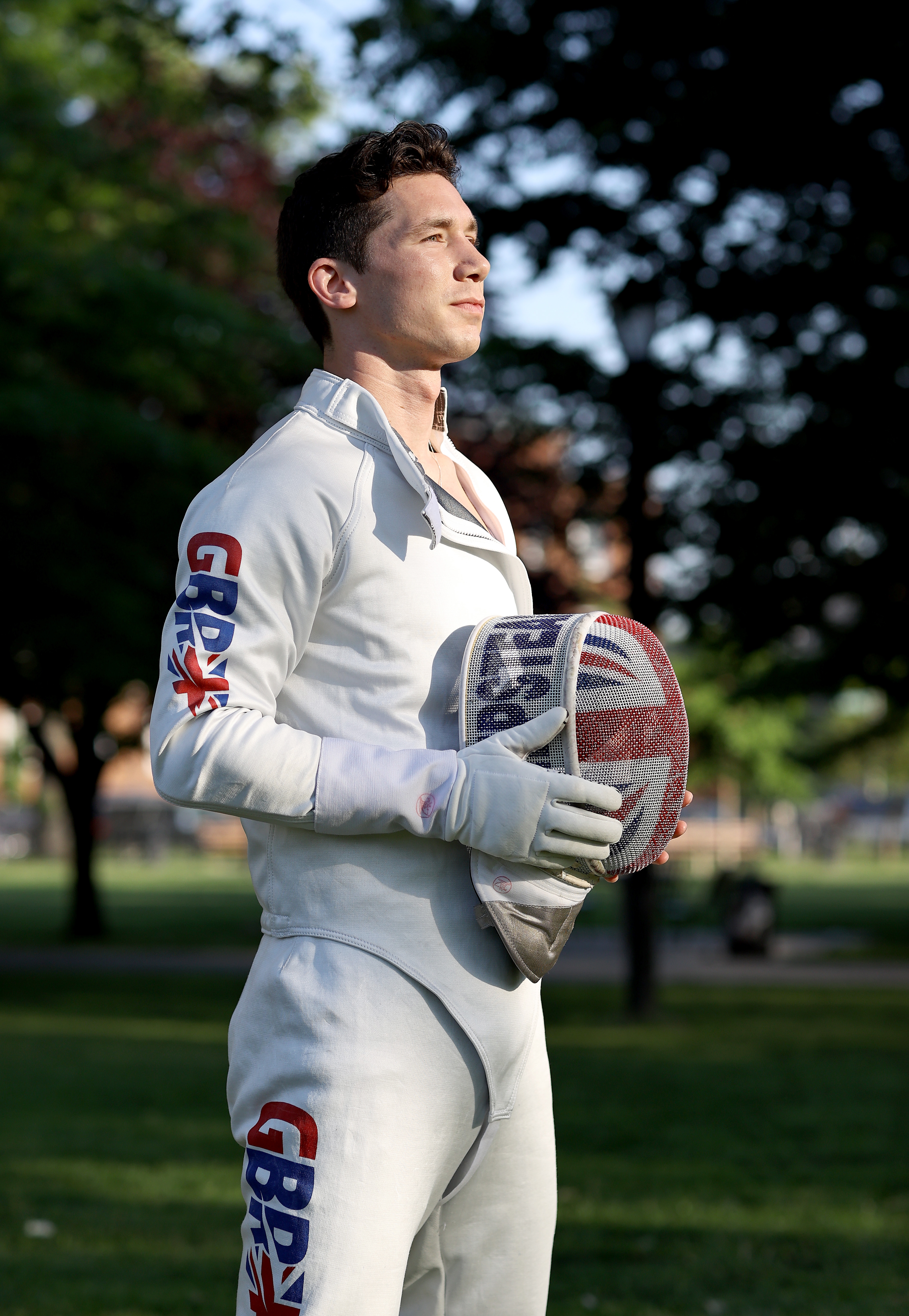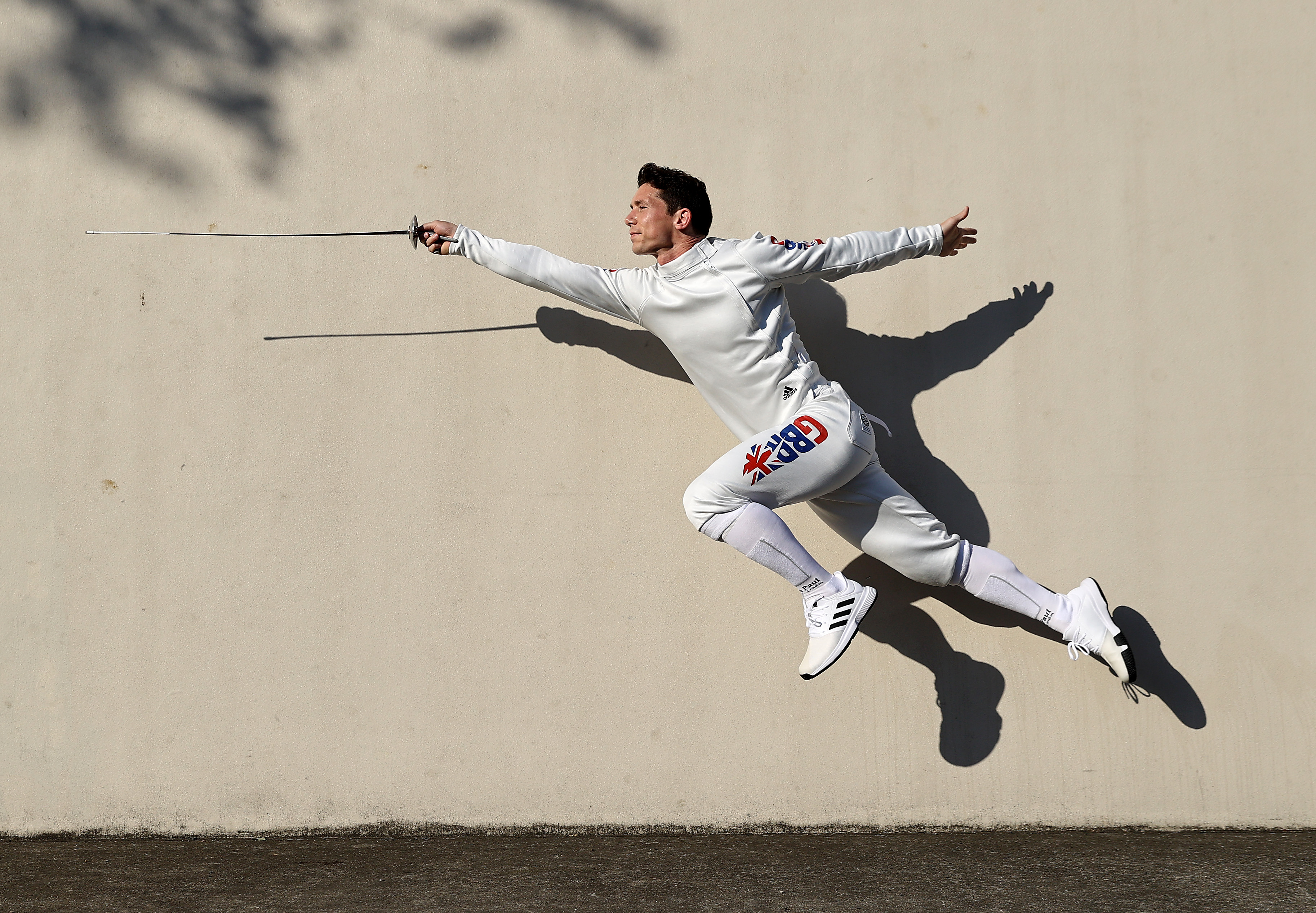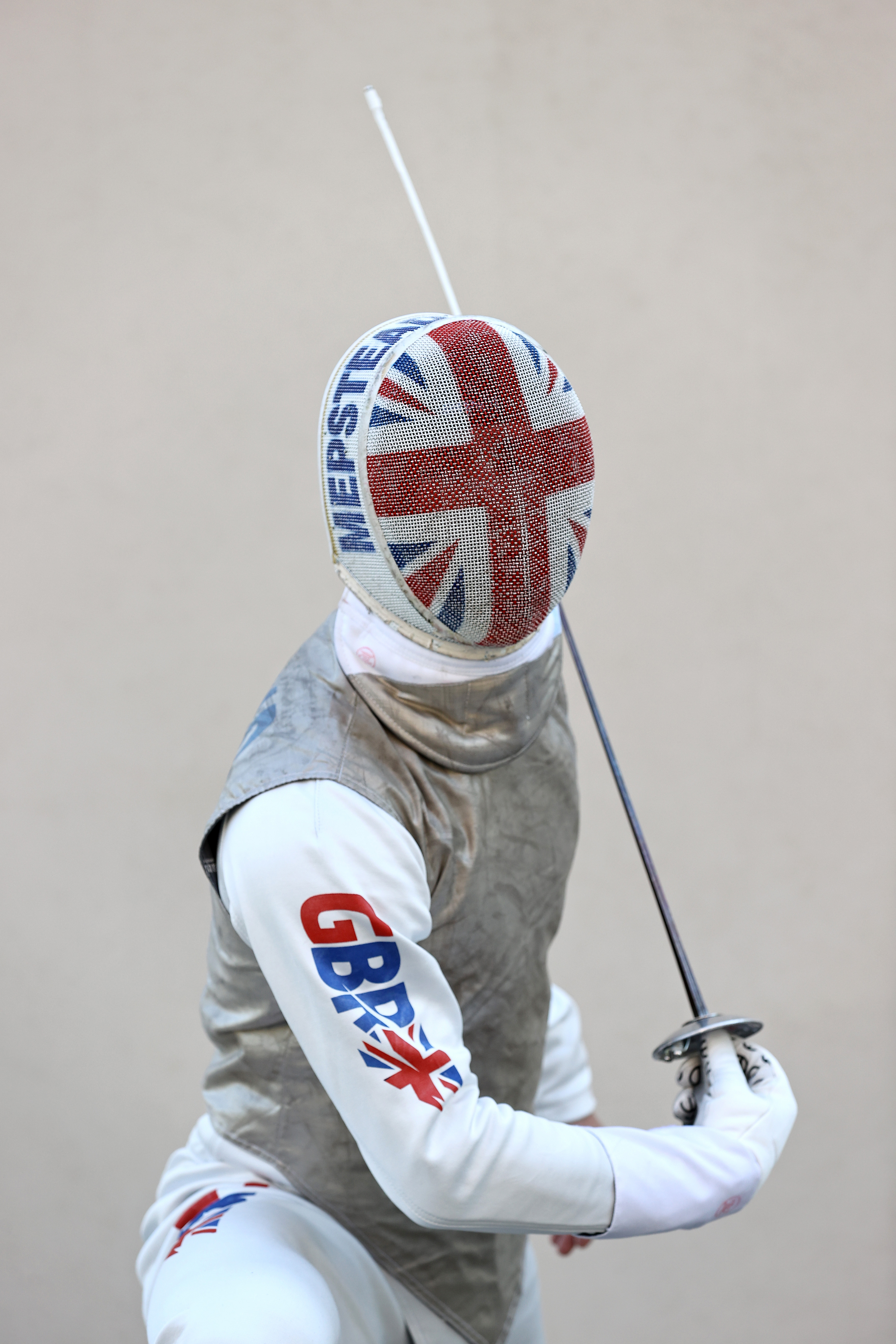

A new GBR national uniform logo has been created for exclusive use during the Tokyo Olympic Games, with plans for an athlete consultation into future adoption after the Commonwealth Championships 2022.
Ahead of the Olympic Games in Tokyo, a new GBR uniform logo has been approved for use and will be worn by Marcus Mepstead when he takes to the piste, after a successful qualification period and recent team announcement by Team GB.
The FIE designated national logo will revert back to the previous GBR design at end of the Olympics, with the Paralympian fencers wearing the prior design. BF will then start a consultation with the GBR athlete community (including BF Athlete Development Programme athletes, British Disability Fencing and British Veterans Fencing) over potentially adopting the new design in the future, after the Commonwealth Championships in 2022.

The logo is part of a suite of branding assets created by agency We Launch, ahead of the Rio Games in 2016. The brief at the time was to reinvent BF’s image and appeal to a wide range of audiences in readiness for the exposure the Rio Games brought to the sport.
On the rebrand, We Launch said, “Every Games provides incredible opportunities for sports to capitalise on the global attention that the Olympics brings. British Fencing not only recognised the importance of having a new brand in place but was clear that this brand had to appeal to everyone. From the gamers that can immerse themselves in a whole new world, through to the general British public that is in awe of the style, skill and athleticism of their heroes.”

The GBR logo features the same red, white and blue colours as the BF main brand, and uses diagonal visual elements to represent the action of the blade, and acknowledge the speed and agility of the athlete. Marcus Mepstead will wear the logo in Tokyo, as seen in Team GB’s team announcement images after his place was officially confirmed in May, 2021.
After an extended wait to see the logo appear in public, Stuart Lang from We Launch, said, “We first began working on the new British Fencing logo back in 2016 – creating a sharp, precise and impactful identity that allowed for the three sword slashes to slice through the logotype. Tokyo has provided the opportunity to finally bring this identity fully to life in the uniform logo. Through the bold lettering and dynamic angular shapes, we wanted it to stand out and above every other nation that our British athletes would be competing against. The journey to Tokyo has been a long one – much longer than expected – but the design is looking so strong. It’s designed to reflect every movement. We can’t wait to see it in competition in July, and hope that it does Marcus proud.”

Images: Getty Images
